The decision making behind the design
The brief we developed for the designer set out a challenging task. We wanted the branding of ISIUM to reflect the feel of an equal meeting of expertise, context, experience and realities of members across the globe working with considerable personal motivation inside systems and outside systems.
We wanted it to reflect the aspiration that we are a networking organisation and a peoples’ organisation AND also analytical and inclusive, not only of people, but of other ways of knowing.
We wanted it to reflect that we are reaching to the unknown seeking out new paradigms AND also harvesting the best of what we know in terms of attitude and knowledge. We wish to change the way we as people connect and act in a world that has developed around a medicalised norm.
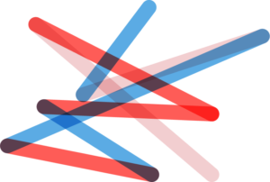
The special global nature of ISIUM became a major design inspiration for the ISIUM logo. The country of citizenship of each of the founding members of ISIUM was marked on a world map. Cutting the map, flipping it and placing one side behind the other created a flat globe and an arrangement of points that worked as the starting point for the design. Coincidentally, the mark for Australia landed exactly in the centre … a nice nod to this being where the organisation began.
Our fundamental values and aspirations for ISIUM were also important in the design process:
- Joining the dots represents the connection of people across the globe and emphasises the way we work.
- The resulting abstract geometric shape is dynamic, bold, strong and intriguing,
 giving a sense of the unknown. It almost looks like a ‘bang’ as if to represent the start of a new world. If you follow the outline of the curve ended lines, they are like a loop, which could represent the continued sharing of information.
 - The shape is strong in its connections, but it also has movement, which could represent the constantly evolving knowledge of health and medicines.
- The open-endedness of the shape denotes it is ‘reaching out’ and open to all people and other ways of knowing.
- The transparency of the lines means that when two lines cross, a new colour is made. This could also represent a new way of thinking that can be achieved by connecting people.
Note of thanks
Our sincere thanks go to Sinéad Murphy, Lovelock Studio, Warrnambool, Victoria (lovelockstudio.com.au), who developed this very attractive artwork pro bono for ISIUM.